


PopPop
PopPop


SKILLS: Fabrication | Illustrator | Experience Design | Arduino | Hardware Prototyping | Rasberry Pi
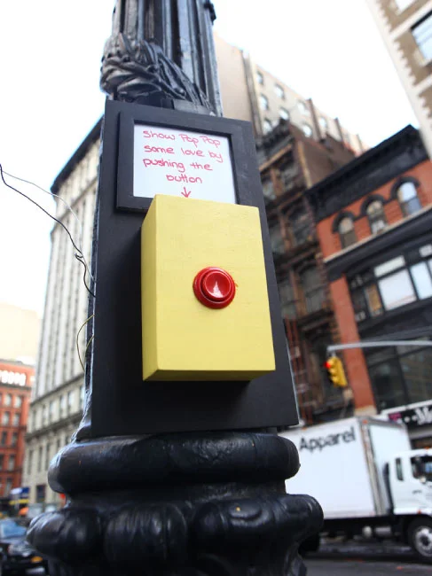
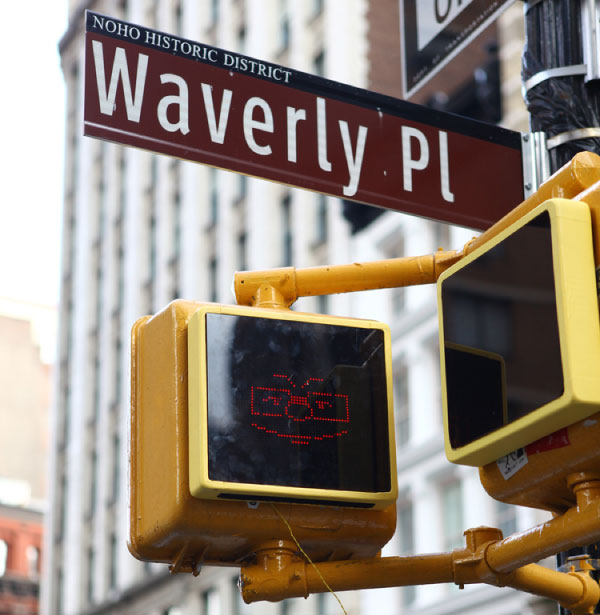
SUMMARY: PopPop is a new type of living pedestrian signal that interacts with a street corner. Are there too many jaywalkers? How crowded is the corner? Is it rainy? PopPop knows and reacts accordingly. Temporarily located in NYC, at Broadway & Waverly
Project Background: PopPop was part of a special Microsoft Research Fuse Labs project setup specifically to explore sentient data and the idea of how can you add sentiment/emotions to data. With more and more objects becoming connected devices (the “Internet of Things”), we felt it was important to explore the relationships that can come from these objects, and how they may make our lives more interesting and fun. We also wanted to explore how personification can change people’s relationship to an object.
Team and your role: Alexandra Coym, Sam Slover, and Steve Cordova, all Master’s students in tech and design at NYU’s Interactive Telecommunications Program.
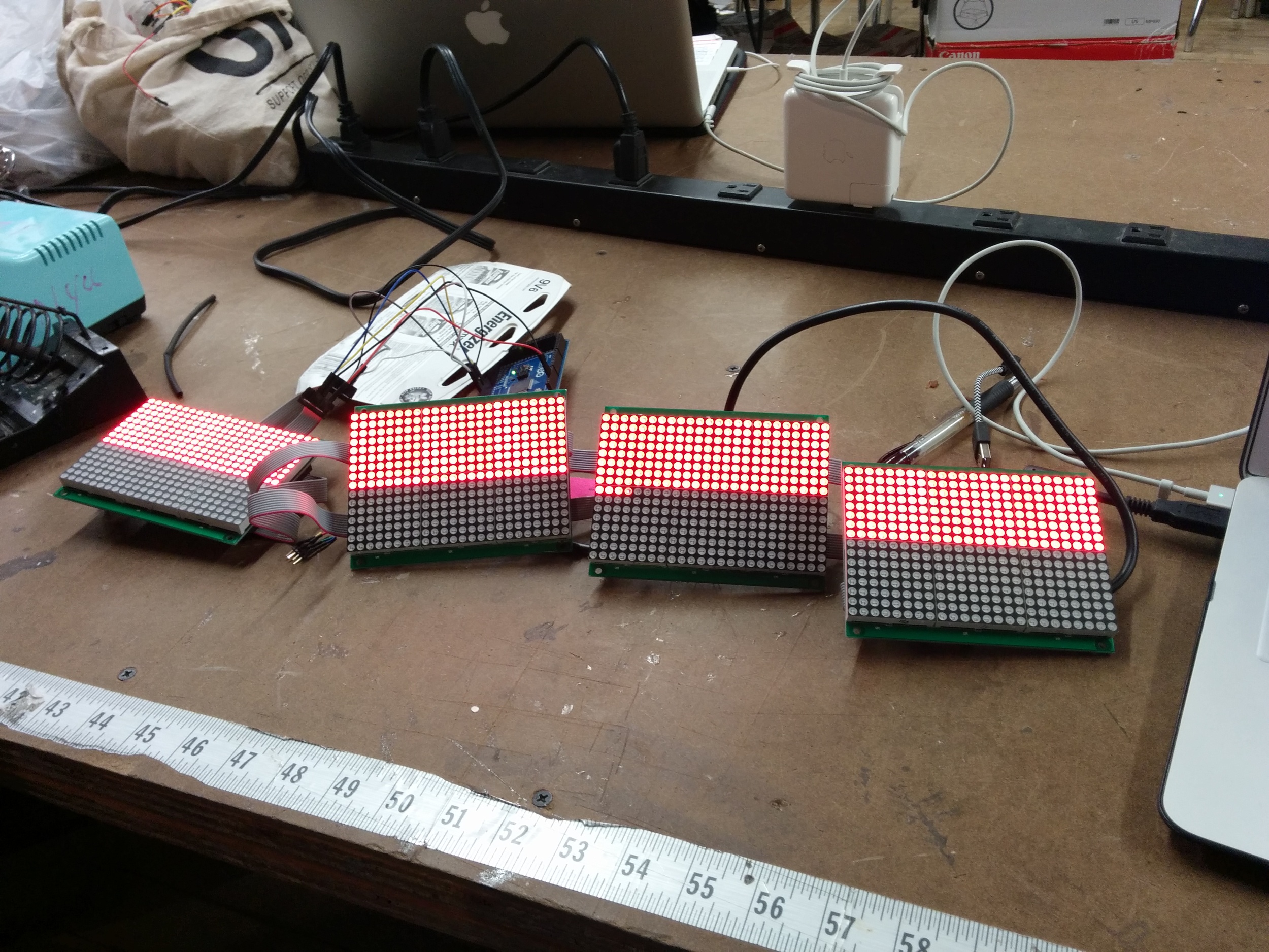
The Work: For the physical build of the pedestrian signal, we constructed custom LED matrix panels (each powered and updated by an Arduino Yun). One panel depicts Pop Pop’s current emotional state and the other panel shows the corresponding text that is communicated to the passer-by.
The build of the signal panels consists of pine, masonite and black plexiglass to make it as similar as possible to a real pedestrian signal.
The Web system is a node.js app that collects real-time data through Mechanical Turk and several hyper-local APIs. Every few minutes, the app pings the Mechanical Turk community to watch a live feed, from which it gets back quantitative data on what they see happening at the intersection (but the camera is set up so faces cannot be detected). The app then combines this data with other APIs (weather, traffic, crime), and does sentient analysis to come up with a current emotion. This can be anything from upbeat to happy to a bit down, and more.
When a new emotion is computed, it is automatically updated on both the physical pedestrian signal (via the Web-enabled Arduino Yuns) and on the website’s front-end (via Web sockets).
Success Metrics: We started this project with a proposal that stated we wanted to personify neighborhoods in a way that is directly correlated to the feelings of the people in that neighborhood. We spent a lot of time thinking about which physical output would display this best, and while discussing the readings, came to the conclusion that we wanted to animate a non-human physical object. Particularly the documentation of MIT’s Blendie and the NYTimes article stuck with us: “(…) given the right behavioral cues, humans will form relationships with just about anything - regardless of what it looks like. Even a stick can trigger our social promiscuity.” This was something we wanted to explore further.
We quickly realized that the scope and the data sets we had been considering (foursquare, facial expressions, etc.) would be so subjective and broad that is would be too disjointed from whatever physical object we wanted to breathe life into. Even within neighborhoods there can be greatly varying emotional states just based on the crossing or block you happen to be on. We want people to relate with their neighborhood, to really connect with it, so we felt we had to be even more site specific.
Through our research, we've discovered that by making a traditional object sentient and giving it human voice and personality, we can more effectively prompt people to perform actions that will make the object happier. This is even more so the case when the user sees the connected object every day and starts noticing that its personality and mood changes based on how safe people are being on the street. We have seen through user testing that people WANT to make their intersection's sentient pedestrian signal happy by being safer on the streets, and that by changing the traditional pedestrian signals to have a broader human voice and personality, people are much more likely to look up, heed its suggestions, and engage with it.
On a broader level, while most of the conversations around connected devices have centered on utilitarian purposes (for example, the quintessential refrigerator that knows when you’re out of milk and orders more), we believe that connected objects can be used in cities to brighten life and help people be safer.
What You Would Have Done Differently: The prototype is using human intelligence, but we’d like to be using machine learning, computer vision and sensors to automate the process for scaling purposes. The idea of animate control systems in cities, giving them human character, is important. It’s known as affective computing, giving human characteristics to machines. Connecting to the mood, gives you an affective bump and in turn creates positive interactions. People respond to a smile. We would have connected our devices to multiple locations to get more varied responses to the efficacy of the device.
Further documentation can be found on our project blog and the project website.
StreetBeacon
StreetBeacon
Skills: Digital Fabrication | Illustrator | CNC | Solar | Visual Design | Prototyping | Rhino
Summary: Street Beacon is a submission for the NYC Reinvent Payphone Challenge, providing real-time, hyper-local info for each payphone. With Street Beacon, every NYC payphone is turned into a sentient agent that tweets real-time updates and messages about its neighborhood
Project Background: New York City launched a Reinvent Payphones Design Challenge inviting participants to redesign New York City's payphones. Street Beacon was our submission for the Challenge. It provided real-time, hyper-local info for each payphone and turned every NYC payphone into a sentient agent that tweeted real-time updates and messages about its neighborhood. Every submission was judged on 5 criteria.
- Connectivity: Ability to connect New Yorkers and enable communication, including for safety and emergency purposes
- Creativity: Originality, innovation and quality of idea
- Visual Design: Including visual appeal and user experience
- Functionality: Flexibility, versatility, scalability, accessibility and sustainability
- Community Impact: Support of local residents, businesses and cultural institutions
Our constraints were baed on connectivity, design, community impact, sustainability, accessibility, and safety.
Team and your role: Dontae Rayford, Robert Sanchez, Steve Cordova, Sam Slover, Victoria Mo, Tom Hsu, Thilmin Gee. I was in charge of web and the design and fabrication of the prototype. We were all involved during the ideation phase.
The Work: When we heard about the Reinvent Payphone project, we really wanted to develop something attention-grabbing and something that looked nicer than the payphones we see today.
After brainstorming for a while, we rallied behind the “beacon” concept. For thousands of years beacons have been used as gathering points, sources of information and navigational guides. And that’s exactly what we wanted our project to represent. We wanted the design of the installation to relay a sense of unobtrusiveness.
In addition to providing the utility of having a place to sit or a phone to use, we also wanted to incorporate elements of sustainability. With power from solar panels and a rooftop garden, we ensured that we could minimize SB’s footprint.
As far as usage was concerned, we wanted the SB experience to be about a two-way dialogue - equipping installations with sensors capable of detecting pollution levels, pollen levels, noise, traffic patterns and more - only to turn around and make all of this data available through our API
So when users get to a kiosk, they’ll be met with tons of rich information via native and 3rd party applications. Relevant commute updates, leads to local businesses, interactive fitness challenges, local history and more. And to make these data sets more robust and more relevant, we capture tons of rich information from user interactions. From sentiment analysis all the way down to user drawn art submission.
All-in-all, we wanted to redefine what it meant to stop at a payphone.
Success Metrics: We won the Payphone Hack Challenge, a lead-up to NYC's Reinvent Payphone Design Challenge. The physical build of a scale model was interesting because it gave us some insight into how people would physically interact with a full size model and how potentially it would look in a city setting.
What You Would Have Done Differently: Had we had the time to make more collateral, I think we should have created a concept video. Sometimes without an added visual component, your idea may not be fully understood. Further iterations in addition to just paper prototyping may have been advantageous. We had an idea of how this would have been used in real space, but more play testing could have affirmed some design decisions. Overall we were very happy with the design and the software component that was built.
Project website can be found here.
Tactus
Tactus
Tactus - See with your finger
Tactus is a wearable device worn on the wrist that interprets color and sends the user a tactile response. Think of it as braille for color. Using embedded sensors on the device, color values are translated to a electromagnetic wave that creates a sensation on the users finger. The device can be used by both visually impaired people and those looking to augment their own senses. It creates a new sensory modality for the user and more importantly the ability to not only see art, but feel it.
That's me getting a magnet implanted in my left ring finger. Yes, it did hurt.
RESEARCH PROCESS
I have taken classes on magnetism, read research papers, and looked in medical journals that explore the topic of synesthesia. Synesthetic mobile apps do exist but are limited in scope and the only physical device that I have come across was developed by Grindhousewetware, which uses an ultrasonic sensor to detect objects in front of the user.
PERSONAL STATEMENT
I began the project with a focus on synesthesia and the ability to induce, over a period of time, a learned response to different stimuli. I believe that humans have the ability to force an evolutionary step in their development. At first, I did not associate my own visual challenges as an influence to my work but with some feedback and a deeper focus on my project, it became apparent that my colorblindness was the motivation for this project.
As a child I was fascinated by shows like “Beyond 2000” and NOVA specials. I remember seeing a segment on a visually impaired person who used echo-location to navigate, allowing him to ride a bike. Another influence of mine is Neil Harbisson, who has labeled himself the first cyborg. He has a device implanted in the back of his skull that sonifies colors. The ability to feel color is a derivative of this work. I also met with Rune Madsen to flush out the mapping of colors to waves and what the feeling should be for each color.
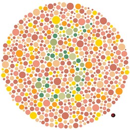
Color is important to me because I’m color-blind. There are several different kinds and degrees of color deficiencies. I’m blessed with the a red green colorblindness. This means that I find it very difficult to distinguish the two, particularly when they are next to each other. I also have a blue saturation in my vision so purple look blue to me. These two graphics show numbers. I don’t know what they are, but I’ve been told it’s a 5 and 2

I may not see the numbers but an interesting question arose for me. How exactly do I know the same color blue to you is the same color blue to me?
This made me think, how does the rest of the world see and further taking this idea to the extreme, how do people who are visually impaired experience color all together.
What I’ve come to realize is that Color is subjective and contextual. Let’s take a look at this image for a minute.
This image is known as the Koffka ring. It’s a uniform gray ring on a light and dark background. When split, the half ring appears to be different shades of gray, and further when shifted the difference appears to be starker. I assure you, It’s still the same gray ring.
So how does design then change, to take this in consideration?
This brings us to current design implications. What you see on the right is a graph using what I call the squiggly lines of death for colorblind people. This particular graph and similar ones like this one from Google Analytics above, are very hard for me to follow. Colors tend to blend together and this graphic becomes too cumbersome and difficult to use. On the left side of the same graph is what normal people see and on the right of the graph,as you can see, the red/green line is hard to differentiate. Many designers do not design with visually impaired people in mind and considering that nearly 10% of the male population is color-blind, that’s a missed opportunity.
My research brought me to a special program conducted by the guggenheim museum for visitors who are blind or have low vision to explore the museum’s work through communication and sensory tools particular to their experience. It’s conducted through verbal imaging and touch. My experience that night showed me that the measurements of what the visitor is facing and the immediate space surrounding them , is very important to begin to visualize the work. The description of light and intensity of colors is subsequently verbally communicated.
My own experience and learning from other people’s experience has led me to my own solution, and it involved magnets!

DESIGN PROCESS
The form factor for this device was something I kept iterating on, from a bracelet, to a cuff, to a small remote-like box a person would hold. The strength of the magnetic field decreases by the inverse of the distance squared. The solution I came up with was to fold your middle and index finger in, like Spiderman, to close the distance between the electromagnet bracelet and the fingertip magnet. This type of tactile feedback allows those who are blind to identify colors and those who are not visually impaired to begin to associate certain tactile responses with colors, giving the user the ability to say “WOW, I really FEEL that color.”
I was intent on using the sensors on the phone for the color processing but I abandoned that idea after I got the feedback that it would be too awkward for the user experience. I added a sensor to the bracelet that would detect color instead.

PRODUCTION PROCESS
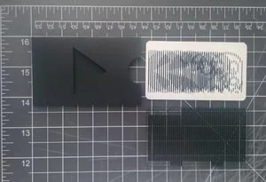
I used different materials for the build. I tried cloth, warped acrylic, and even leather straps. I ultimately ended up laser cutting a design on acrylic sheets for my bracelet based on a geometric pattern that incorporated space and aesthetic appeal in one.
I also took a full physics course on magnetism and electricity to help me understand the mechanism by which this all works.


COLOR MAPPING
Light as we know functions on a visible spectrum from red to violet. Red being the longest wave and shortest frequency to violet which has more energy and shorter wavelengths. After the design process I was tasked with mapping this color to what I think should be the most appropriate sensation for a color. I focused on Red, Green and Blue. Red to me evoked passion, danger, akin to a heartbeat. That made me associate it with a square wave.That thumping and solid vibration. Green grows, evokes nature, expansive so I chose the saw wave as it dips and grows. And finally the color blue is calm and not sharp. It’s soothing and that is a sine wave.

After associating these sensations, I began to feel color even without my bracelet. Many electronic device emit their own wave. The microwave emits a sine wave at 60 HZ. One day after passing by the microwave someone left on I immediately felt the color blue.
It was at that moment that my sensation turned into a perception. When plugging my mac charger into the wall, I felt red, walking out to the street, I began to feel more and more colors. Particularly the ones from the subway power generators. As a side note, you’d be surprised by the sheer number of underground power generators that exist in New York City. They’re all over the place..and I know this because I feel them everyday while walking to school. There is a ton of electro magnetic radiation all around us.
TACTUS COMPONENTS
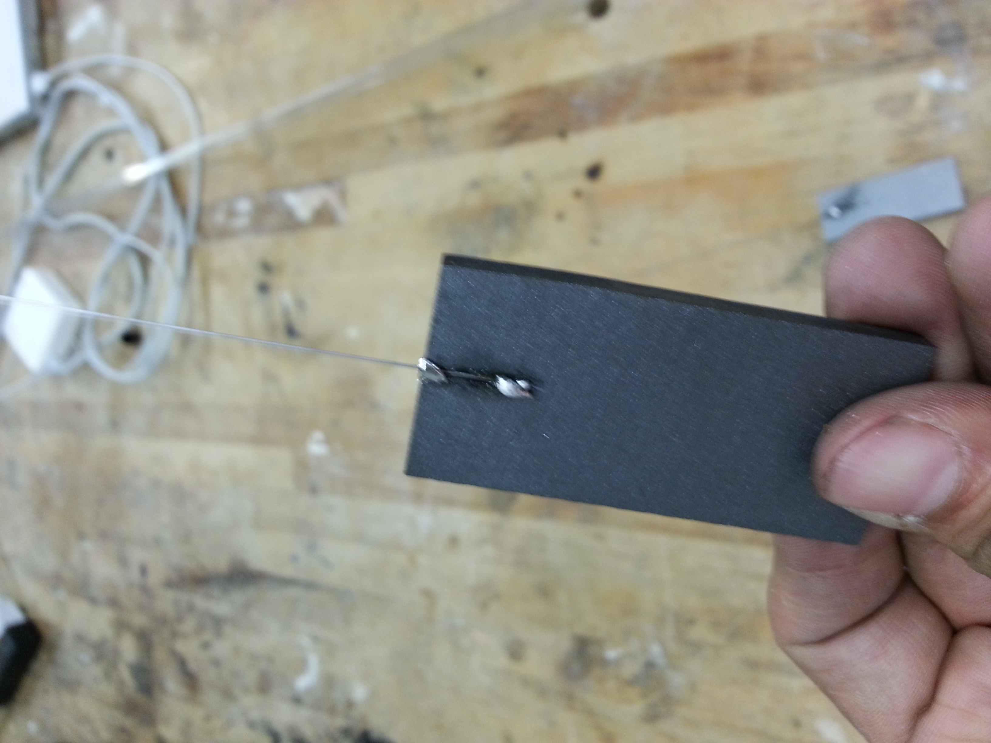
There are 5 critical components needed for the device to function. A color sensor detects variations in the light bounced from objects in front of the onboard photocell. This data is processed by the arduino micro which calculates what color is in front of the sensor. According to which color is detected, this information is then passed on to the function generator, which creates the appropriate waveform, frequency, and amplitude of the wave down to the electromagnet. The electromagnet then emits the waveform, in the form of a square wave, pulse wave, saw wive,, or sine wave, that I’m able to feel through the magnet in my finger. This is all powered by a 12v power supply. I’d like to stress here, that there are no moving parts in this device.
The brighter the color, the faster the frequency and the more saturated a color is, the higher the amplitude.

CONCLUSIONS
There were two big revelations for me during this whole process. First, I actually had my sensation turn into a perception with extended use. Second, that everything is a wave. The physics portion of my research led me to tie in many unseen things that we never question relating to how they work from radio signals, to how information is sent, to how we perceive color. It was a big A-HA moment for me. The challenge for me was from a build perspective in designing the analog function generator small enough to fit unobtrusively on a bracelet. I would like to take this further and add more modular components to sense new things outside of just vision, perhaps radio waves, or even UV and infrared.
PressPlay
PressPlay


Frontside of business Card
SKILLS: Fabrication | Illustrator | Experience Design | Laser Cutting | Paper Prototyping
SUMMARY: PressPlay is novel way of displaying analog animation in the form of a business card. A striped acetate overlay is superimposed on an altered set of images and then moved from side to side to create the illusion of movement.
Project Background: I came across a book called Gallop! at the MOMA store, which showcased a set of scanimations. This caught my eye for its simplicity and form. I figured out how to create the animations and promptly created a set of business cards to show off the technique
Team and your role: This was a solo project
The Work: The first thing to do is know how many frames you need in your animation. In my trials, anything over 6 frames becomes less visible and the illusion is lost. I created my image frames, first in illustrator and then subsequently I wrote a sketch in processing to automate the process, The video to the right shows my first printout. I made a few tweaks after that to finalize the form. I lasercut the card holder and decided to add a second animation (PacMan) on the back of the card. The number of frames corresponds with the width of the black bars and the slits. For example if you only wanted four frames, the width of the black bar would be three times the width of the slit.
What You Would Have Done Differently: I would have made the whole business card self contained. Although i'd lose the ability to swap in more animations and utilize the back of the business card for a second animation, having less parts limits the risk of losing any portion of the card.
Staquaponics
Staquaponics


Skills: Digital Fabrication | Illustrator | Urban Gardening | Solar | Circuit Design | Visual Design | Prototyping
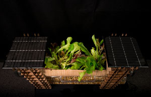
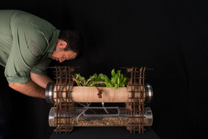
Summary: Solar Powered Stackable Aquaponic Garden. A modular closed loop system used to grow plants utilizing the waste from the fish tank as fertilizer.
Project Background: Sustainable Energy Class Final Project. The challenge was to create a device that would perform a function without the use of batteries or plugging in to an outlet. Energy could only be derived from its users or the surrounding environment and energy usage in terms of input, storage, and output, with efficiencies at each stage. had to be quantified.
Team and your role: This was project was done individually.
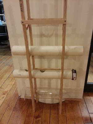
The Work: There are multiple ways to harvest and produce energy (chemical, kinetic, solar, wind, etc...) Previously, I created a Microbial fuel cell (MFC) using bugs as fuel to power an analog clock. I wanted to try my hands on solar for this project. As a participant in Farm School and with some inspiration of Brita Riley's work on WindowFarms, I wanted to incorporate Urban Farming to my project. I decided to make a stackable solar powered aquaponic garden.
Urban Farming's popularity has grown and with people now more worried about the produce they consume, the ability to grow your own Non-GMO vegetables in a viable way has become attractive for people. Space is always a concern in urban areas, so my idea of creating a modular and stackable system was ideal.
Current aquaponic systems are large, industrial, fixed, and with little to no design aesthetics as you can witness from the images on the left. They are not modular and require a power source.
The aquaponic cycle is a closed loop system. You start off with fish that produce fish waste which is pumped to the plants as a fertilizer. The plants in turn filter the "waste water" and return clean water back to the fish, without the use of a filter pump.
My first Iteration was a disaster! It was non-modular with an articulated arm that contained solar panels. As a first prototype, it was not visually appealing and hard to transport. I had to make it stackable and easy for people to disassemble when needed. Making it modular was a priority. My initial desire was to make this into a kit anyone could build. For fast prototyping, I am a fan of using masonite. It cuts well and clean in a laser cutter and provides the structural integrity I needed for the base. The materials I used were:
- 3 Goldfish
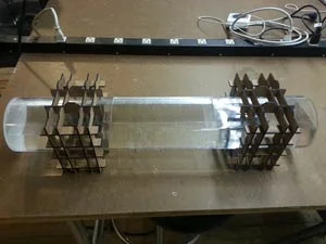
- 4.5 inch diameter Acrylic tube for the fish
- 4.5 inch diameter PVC pipe
- 1/8 inch Masonite board
- Caps for the PVC pipe
- Clay Pellets
- Rocks for the fish tank
- 2 solar panels from Adafruit.com - Each panel is 6 Volts
- Peristaltic Liquid Pump with Silicone Tubing
- Clear tubing
- Silicon to cap the drip from the plant tube and the spigot
- Spigot
- Wire
- Solar Engine circuit
- A roll of Wood Veneer
- Contact Cement
Success Metrics: The difficulty I encountered was in creating the circuit needed to maintain the pump functional. Although the solar panel, hooked up in series, provided a bit over 12 volts at 250 Milliamps, I needed a higher amount of starting current to get the pump working. There were two ways to doing this. Creating a solar engine circuit that would charge up some capacitors or using a diode with a 6 volt battery attached to the the solar panel to get the pump started. The Open Circuit Voltage measured at 10.6V and Short Circuit Current at 0.45A, I got about 3.65 W in direct sunlight from the solar panel.
Below is the video of the pump working alongside the circuit diagram for the solar engine. Lettuce was grown and maintained in this enclosure.
What You Would Have Done Differently: I was happy with the end result but there definitely could have been improvements in the design and material choices. I would have added copper tape to minimize the usage of wire from the solar panel to the pump. I would have also added a carbon filter to fully filter anything the plants were unable to filter back down to the fish.
Time Flies
Time Flies


Skills: Fabrication | Illustrator | Energy | Experience Design | BioTech
Summary: Time Flies is a microbial fuel cell that powers an analog clock by using the carcasses of insects as a fuel source for the geobacter in the fuel cell. I used live Madagascar hissing cockroaches and crickets to enhance the experience.
Project Background: Set the context for the project. What was the goal of the project? What were your constraints? What was the timeline?
Team and your role: This was an individual project
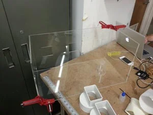
The Work: I decided to build a Microbial fuel cell (MFC) using bugs as fuel to power an analog clock. I've come across some conceptual ideas of using MFCs using flies, mice, and even poop. It really struck me as a cool idea that I wanted to expand on and learn the intricacies of building an MFC. I've come to find out that the field of research regarding MFCs is sill very new which gives much room to experiment and explore. There is not a real net science and I like the flexibility which that affords. I began by getting bugs form ColdBloods.com and they were nice enough to send me crickets, mealworms, and Madagascar hissing cockroaches at no charge! I then proceeded to buy acrylic to build the enclosure from Canal Plastics. All other material was purchased at Home Depot Materials used:
- 12x24 3/16 inch clear Acrylic Sheets - 3 units
- 12x12 3/16 inch clear Acrylic Sheets - 4 units
- Silicone Glue
- Acrylic Glue
- 3 hinges
- 3 long 2 x 11/16 inch slabs of acrylic for the MFC
- 1/4 inch threaded metal rod
- Titanium wire
- Copper Wire
- Nafion Proton Exchange Membrane
- Clear 1/4 inch hose
- 3 syringes
- 2 packs of yellow plastic gloves
- zip ties
- Analog clock
- 3 white plastic plumbing tubes
- Wing nuts
- Microbial septic tank cleaner
- Fuel Cell Grade Graphite Bipolar Plate 5mm, 4x4


I began by making the enclosure from the acrylic sheets purchased and laser cutting the holes for the hands and syringes. Single sheet prepped for laser cutter. I used acrylic glue to bond the sides of the container together. After the container was set with the top, I emptied the container of crickets and Madagascar Hissing cockroaches into the container.


The hardest part was building the actual fuel cell. I used planks of acrylic which were further refined and cut using the CNC. Creating the pits for the acrylic was cool but also terrifying as one acrylic shard broke up and was sent flying out in the shop. Luckily no one was hurt, but it was too close of a call.
I built a two chamber MFC using a graphite carbon plate which I cut to fit into the MFC. I also purchased a Nafion Membrane which allows for only positive ions to make the transfer from the Anode chamber over to the cathode chamber where oxidation occurs and water is made.
The membrane between the Anode and Cathode chamber required some manual drilling to hold the Nafion sheet in place in addition to allowing space for the protons to travel.
I began by making the enclosure from the acrylic sheets purchased and laser cutting the holes for the hands and syringes.
Go deep to show what you produced. Research, sketches, wireframes, mocks, and a link to working site or application if possible.
Success Metrics: Why are you showing me this project? Do you have any results that show this project achieved its intended goal?
What You Would Have Done Differently: Based on the process and outcome is there anything you learned you would have done differently? This is a great way to show growth and introspection.
-
-


Skills: Design | Illustrator | Experience Design | Game Design
Summary: Conspiragram is a pervasive adventure/tag game that raises awareness about privacy and surveillance. Players seek out and photograph recent Instagram users in real locations and then tag them on Instagram.
Project Background: Big Games final. Our idea was to make a scavenger hunt/tag game based on real people's Instagram posts. We wanted to generate conversation around social media privacy and surveillance and to inspire users to use social media with more intention.
Team and your role: Team mbers included Andres Taraciuk, Jon Wasserman, Todd Bryant and Steve Cordova.
The Work: The spirit of the game was one that is everlasting. Users, Wwhenever they want, can switch in and out of Conspiragram Mode, seamlessly. They assume their spy alter-ego.
When in the game, the goal is to look for people that posted to Instagram either by looking at your friend feed or searching for location based hashtags, take a picture of them or what they took a photo of, upload it and tag the other person.
Player Type Points of Entry
Achievers- Go for volume, leaderboard achievement
Killers- Go for the person/location, love of the hunt
Socializers- May not hunt, but watch the lead
board. Don't want to play the game, but like that it exists.
Explorers- Exploit weaknesses in game mechanics. Also explore the various ways to identify targets and score points
Game Mechanics:
To enter a submission to #Conspiragram players must include:
#conspiragram
@targetname
#playername
#location
Players get 1 point for emailing the picture and the tags to the conspiragram email and 3 points for posting in their own instagram account with the relevant tags. Tagged player loses same amount of points to avoid teamplay abuse
More documentation can be found here.
Success Metrics: Difficulties
Problem: Instagram API doesn't allow posting pictures. It can only be done through the app.
If there is one shared Instagram account, players can delete/edit other posts.
Question: Will people play if they have to post from their personal account?
Open discussion: What other alternatives are viable?
Why are you showing me this project? Do you have any results that show this project achieved its intended goal?
What You Would Have Done Differently: Based on the process and outcome is there anything you learned you would have done differently? This is a great way to show growth and introspection.
Glockentar
Glockentar


Skills: Fabrication | Illustrator | Projection Mapping | Arduino | Experience Design
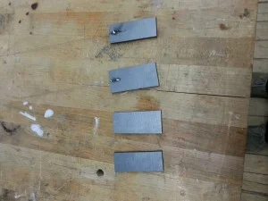
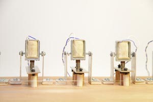
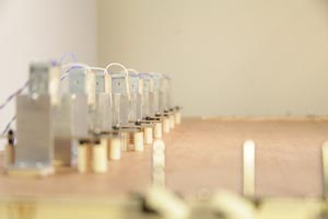
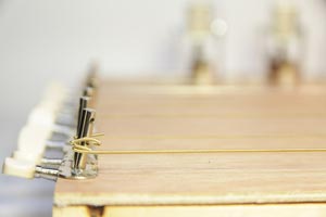
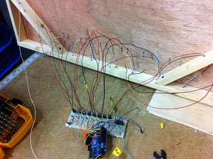
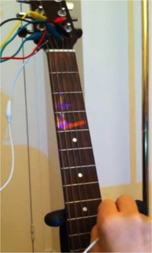
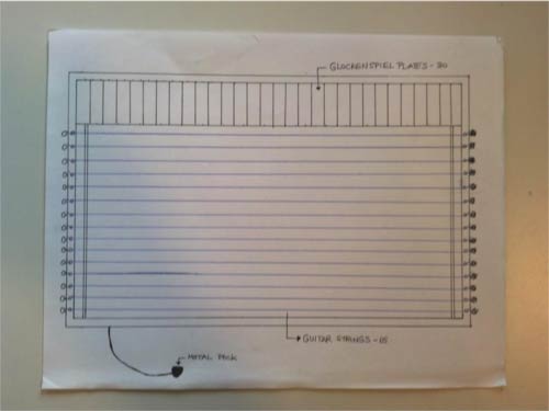
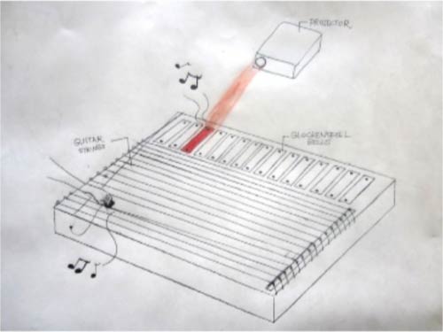
Summary: A robotic glockenspiel triggered by plucking guitar strings, with beams of light projected on the strings. Each time a string is plucked a corresponding bell is struck and a beam of light flows up and down the length of the string.
Project Background: the idea to projection map onto a guitar; a color image is projected onto the fretboard each time a string is plucked. wanted to combine the pleasant and soothing sounds of the glockenspiel and the guitar. We talked a lot about how this piece of instrument would manifest visually and physically. We toyed around with the idea of using just the strings with projections as a larger than life size musical instrument interactive installation. Then we decided on a self contained instrument Initially the format still retained the bodies of a guitar and the glockenspiel; eventually we paired it down to only the strings and bells. To replace the glockenspiel playing sticks, we decided to use solenoids to tap the underside of the bells each time a string is plucked. Each guitar string initiates a specific bell, creating a harmonious sound.
Furthermore, we wanted to projection map onto the triggered glockenspiel bell as a string is plucked
Set the context for the project. What was the goal of the project? What were your constraints? What was the timeline?
Team and your role: Team members included Sonia Li, Aaron Sherwood, and Steve Cordova
The Work: Go deep to show what you produced. Research, sketches, wireframes, mocks, and a link to working site or application if possible.

Success Metrics: Why are you showing me this project? Do you have any results that show this project achieved its intended goal?
What You Would Have Done Differently: Based on the process and outcome is there anything you learned you would have done differently? This is a great way to show growth and introspection.