
Tactus - See with your finger
Tactus is a wearable device worn on the wrist that interprets color and sends the user a tactile response. Think of it as braille for color. Using embedded sensors on the device, color values are translated to a electromagnetic wave that creates a sensation on the users finger. The device can be used by both visually impaired people and those looking to augment their own senses. It creates a new sensory modality for the user and more importantly the ability to not only see art, but feel it.
That's me getting a magnet implanted in my left ring finger. Yes, it did hurt.
RESEARCH PROCESS
I have taken classes on magnetism, read research papers, and looked in medical journals that explore the topic of synesthesia. Synesthetic mobile apps do exist but are limited in scope and the only physical device that I have come across was developed by Grindhousewetware, which uses an ultrasonic sensor to detect objects in front of the user.
PERSONAL STATEMENT
I began the project with a focus on synesthesia and the ability to induce, over a period of time, a learned response to different stimuli. I believe that humans have the ability to force an evolutionary step in their development. At first, I did not associate my own visual challenges as an influence to my work but with some feedback and a deeper focus on my project, it became apparent that my colorblindness was the motivation for this project.
As a child I was fascinated by shows like “Beyond 2000” and NOVA specials. I remember seeing a segment on a visually impaired person who used echo-location to navigate, allowing him to ride a bike. Another influence of mine is Neil Harbisson, who has labeled himself the first cyborg. He has a device implanted in the back of his skull that sonifies colors. The ability to feel color is a derivative of this work. I also met with Rune Madsen to flush out the mapping of colors to waves and what the feeling should be for each color.
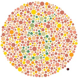
Color is important to me because I’m color-blind. There are several different kinds and degrees of color deficiencies. I’m blessed with the a red green colorblindness. This means that I find it very difficult to distinguish the two, particularly when they are next to each other. I also have a blue saturation in my vision so purple look blue to me. These two graphics show numbers. I don’t know what they are, but I’ve been told it’s a 5 and 2

I may not see the numbers but an interesting question arose for me. How exactly do I know the same color blue to you is the same color blue to me?
This made me think, how does the rest of the world see and further taking this idea to the extreme, how do people who are visually impaired experience color all together.
What I’ve come to realize is that Color is subjective and contextual. Let’s take a look at this image for a minute.
This image is known as the Koffka ring. It’s a uniform gray ring on a light and dark background. When split, the half ring appears to be different shades of gray, and further when shifted the difference appears to be starker. I assure you, It’s still the same gray ring.
So how does design then change, to take this in consideration?
This brings us to current design implications. What you see on the right is a graph using what I call the squiggly lines of death for colorblind people. This particular graph and similar ones like this one from Google Analytics above, are very hard for me to follow. Colors tend to blend together and this graphic becomes too cumbersome and difficult to use. On the left side of the same graph is what normal people see and on the right of the graph,as you can see, the red/green line is hard to differentiate. Many designers do not design with visually impaired people in mind and considering that nearly 10% of the male population is color-blind, that’s a missed opportunity.
My research brought me to a special program conducted by the guggenheim museum for visitors who are blind or have low vision to explore the museum’s work through communication and sensory tools particular to their experience. It’s conducted through verbal imaging and touch. My experience that night showed me that the measurements of what the visitor is facing and the immediate space surrounding them , is very important to begin to visualize the work. The description of light and intensity of colors is subsequently verbally communicated.
My own experience and learning from other people’s experience has led me to my own solution, and it involved magnets!

DESIGN PROCESS
The form factor for this device was something I kept iterating on, from a bracelet, to a cuff, to a small remote-like box a person would hold. The strength of the magnetic field decreases by the inverse of the distance squared. The solution I came up with was to fold your middle and index finger in, like Spiderman, to close the distance between the electromagnet bracelet and the fingertip magnet. This type of tactile feedback allows those who are blind to identify colors and those who are not visually impaired to begin to associate certain tactile responses with colors, giving the user the ability to say “WOW, I really FEEL that color.”
I was intent on using the sensors on the phone for the color processing but I abandoned that idea after I got the feedback that it would be too awkward for the user experience. I added a sensor to the bracelet that would detect color instead.

PRODUCTION PROCESS
I used different materials for the build. I tried cloth, warped acrylic, and even leather straps. I ultimately ended up laser cutting a design on acrylic sheets for my bracelet based on a geometric pattern that incorporated space and aesthetic appeal in one.
I also took a full physics course on magnetism and electricity to help me understand the mechanism by which this all works.


COLOR MAPPING
Light as we know functions on a visible spectrum from red to violet. Red being the longest wave and shortest frequency to violet which has more energy and shorter wavelengths. After the design process I was tasked with mapping this color to what I think should be the most appropriate sensation for a color. I focused on Red, Green and Blue. Red to me evoked passion, danger, akin to a heartbeat. That made me associate it with a square wave.That thumping and solid vibration. Green grows, evokes nature, expansive so I chose the saw wave as it dips and grows. And finally the color blue is calm and not sharp. It’s soothing and that is a sine wave.

After associating these sensations, I began to feel color even without my bracelet. Many electronic device emit their own wave. The microwave emits a sine wave at 60 HZ. One day after passing by the microwave someone left on I immediately felt the color blue.
It was at that moment that my sensation turned into a perception. When plugging my mac charger into the wall, I felt red, walking out to the street, I began to feel more and more colors. Particularly the ones from the subway power generators. As a side note, you’d be surprised by the sheer number of underground power generators that exist in New York City. They’re all over the place..and I know this because I feel them everyday while walking to school. There is a ton of electro magnetic radiation all around us.
TACTUS COMPONENTS
There are 5 critical components needed for the device to function. A color sensor detects variations in the light bounced from objects in front of the onboard photocell. This data is processed by the arduino micro which calculates what color is in front of the sensor. According to which color is detected, this information is then passed on to the function generator, which creates the appropriate waveform, frequency, and amplitude of the wave down to the electromagnet. The electromagnet then emits the waveform, in the form of a square wave, pulse wave, saw wive,, or sine wave, that I’m able to feel through the magnet in my finger. This is all powered by a 12v power supply. I’d like to stress here, that there are no moving parts in this device.
The brighter the color, the faster the frequency and the more saturated a color is, the higher the amplitude.

CONCLUSIONS
There were two big revelations for me during this whole process. First, I actually had my sensation turn into a perception with extended use. Second, that everything is a wave. The physics portion of my research led me to tie in many unseen things that we never question relating to how they work from radio signals, to how information is sent, to how we perceive color. It was a big A-HA moment for me. The challenge for me was from a build perspective in designing the analog function generator small enough to fit unobtrusively on a bracelet. I would like to take this further and add more modular components to sense new things outside of just vision, perhaps radio waves, or even UV and infrared.